How to think and learn about design. Also, I'm designing and building a Pokédex!
I just want to polish my design skills
I like programming and learning about stuff I find interesting. Particularly interested in functional programming and typing systems.
I have a background in Cognitive Science/Psychology and Mathematics. Sadly halted due to physical and mental health issues arising from getting Covid. Which unfortunately hit me quite hard back on 2020. I'm still dealing with some sequels so I would prefer working from home.
I find it fun trying to find insights that cut across disciplines. I tend to favor the "theoretical" side of things. But I also try to get as much hands-on experience as possible.
I am writing a blog. Trying to share what I learn, and that others might find useful. I try to focus on the unique things I can bring to the table. Hoping to add value to the life of other developers. I always have a thousand ideas racing through my mind, so I don't have any trouble coming up with ideas on what to write. If any, I have a hard time cutting down on the number of things I want to write about :D
On a personal note. I have always been quite solitary and introverted. But I don't think I'm shy. I love videogames and started programming because I wanted to make my own.
I want to design an app. And build it with Next.js, tailwind CSS, and AWS. The build part is straightforward, even if not easy.
But the design part?
First, some preliminary research, then let's put it into practice!
I don't have the faintest idea on how to start. So, as always, my first solution is to do some research.
In this essay, I will elaborate on what I have learned about design, and what it is. To get some practical advice for me on how to do it. To learn how to build an app.
Then I will design an app using that practical advice. A Pokédex. I will build it in subsequent posts. To keep this post as uncluttered as possible.
The dribbbilisation of design
I recently read a thought-provoking article titled "The dribbbilisation of design" by Paul Adams. Which I highly recommend that you check out if you are interested in design and UX. Most of this blog post will be heavily based on the discussion on that article.
Here's the main thesis: The craft of design is net moving backward due to designers designing for designers. Not for users. The social-media-ness of websites like dribble leads their communities to put an emphasis on new design goals for designers participating. Designers now have the socially-favored goal of making designs that appeal to their peers. Instead of, you know, designing for solving user needs.
The author argues that the community around dribble (and other design-focused social media) rewards superficial work. Yet design is anything but superficial. Thus, the whole craft is marching backward. Much to his dismay.
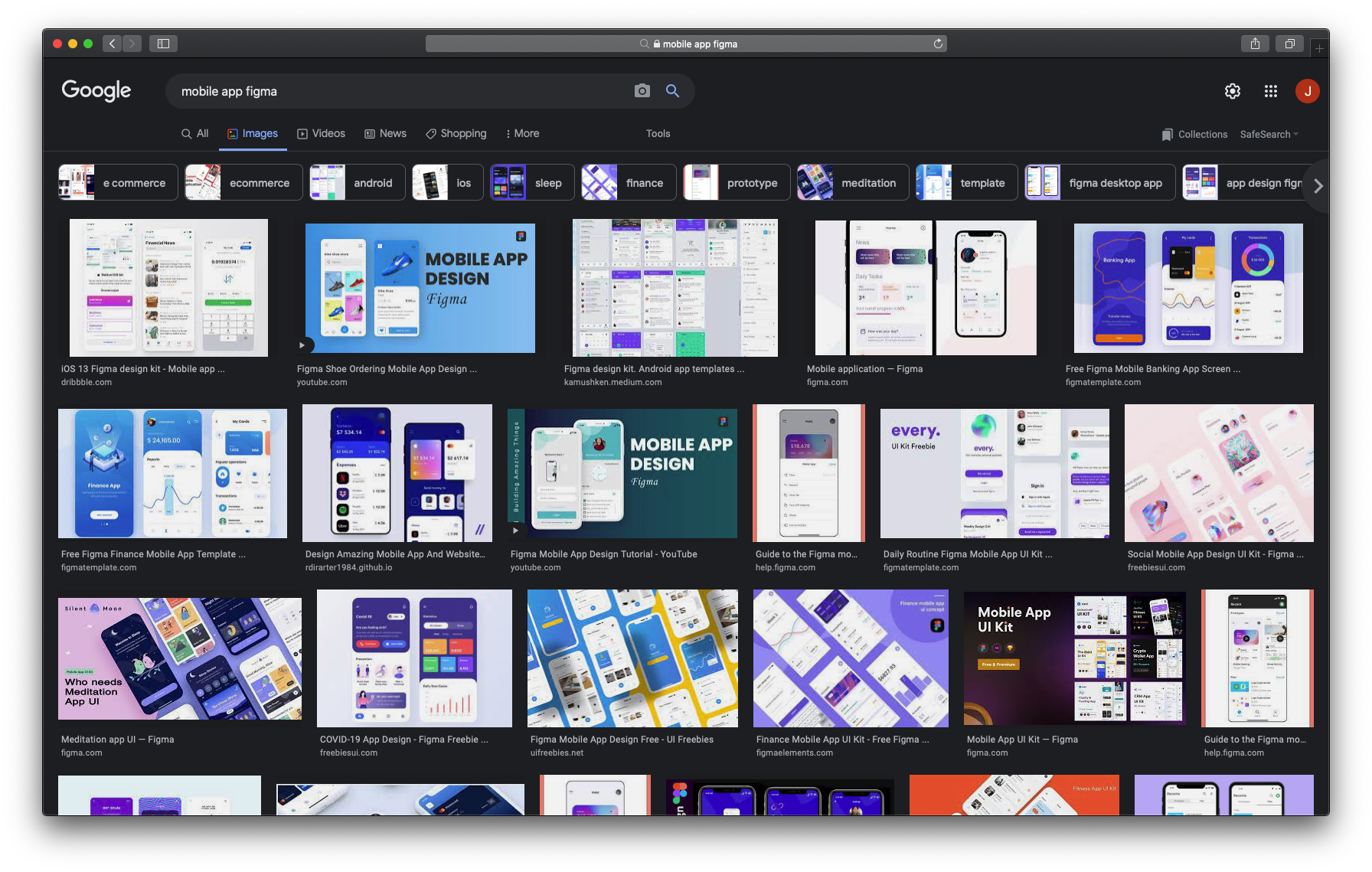
I'm sure you have seen it. That style that appears on every google image search for "mobile app Figma". Here, let me share a screenshot.
In 2020, blogger Teisanu Tudor decided to do a clever etnographic study of Instagram UX-ers in their natural habitat. He disguised himself as an Instagram "UX influencer" with the purpose of understanding why and how designers share their work.
The initial assumption was that "most people create UX-design-related posts on Instagram only to increase exposure, audience and potential leads". And the ensuing study was directed at testing that assumption. His findings were quite nuanced. And sheds some light on the subtleties involved in analyzing complex social phenomena.
For most people, exposure, and leads are consequences rather than goals
The primary goal seems to be to receive validation on their skills from other designers in the community
Joining the community is easy, if you follow the rules and definition of what UX is!
Criticism, no matter how small, triggered defensive and sometimes aggressive behavior. But at the same time, it encouraged people to speak up against a shallow definition of design. But real discussions are difficult.
Thanks to Instagram's format, the meaning of UX seems to be shifting. It is now ok to describe it as shiny, visual and conceptual work.
The same applies to tutorials.
It seems that gatekeep-ed communities tend to favor groupthink and shallow definitions of complex ideas. A social reward system that thrives in quick and easily-digestible content is the consequence of millions of participants competing with each other for social validation.
Thus, the underlying ideas tend to converge into watered-down versions of themselves.
He concludes his study by saying:
"Well…doesn’t it bother anyone that people look at these platforms and see design as a continuously positive, happy, easy, 10-step-quick-learn discipline? How can we both argue for design requiring method, process, and investment, while not caring about the way it’s presented in communities (as the one on Instagram, described here) which will only grow? This positive loop backed by a community that can’t react to constructive criticism can only be toxic towards our field. We did what we know best, we abused a product. We took an existing channel, we saw that there are millions of people using it, and fed them with tiny pieces of information which are easy enough to grasp, but difficult enough to turn them into the pseudo-experts."
Ouch...
I'm gonna leave you with some thoughts of my own.
There seem to be two ways that ideas (the scientific term is memes, but not necessarily the internet kind) can spread.
Either by serving as a trigger for honest discussion. So each participant can share their opinion.
Or by dominating and extinguishing all other ideas in the community.
The big drawback of the second is that groupthink is favored. Eventually, any other opinion becomes heretical or at least perceived as offensive.
Does your community put rules of courtesy that discourage any kind of criticism? Then it may run the risk of "dribbbilisation".
Please keep in mind that feedback, and constructive criticism, is not necessarily at odds with courtesy. I just don't like it when people confuse courtesy with no-criticism.
In fact, I would argue that a community that favors dull "great job!" comments with no real substance tends to dribbbilisation. Which kills the diversity of ideas and opinions.
And, ultimately, makes creativity impossible.
Which is something that really breaks my heart.
Why is this relevant?
Well, I am researching how to design an app. I am now aware of one BIG potential pitfall I may otherwise fall into during my quest.
I should avoid "dribbbilised" tutorials and resources like the plague!
In a particularly perverse twist, I am more likely to find worthless tutorials than genuinely useful ones. Due to the social dynamics of the whole dribbbilisation phenomena.
There's some Grasham's law crap going on. Bad design drives out good design. Just like bad money drives out good money.
Put in behavioral terms. Bad behavior, when valued the same (or more), will drive out good behavior in a social group.
The bad behavior, in this case, is, obviously, the "path of least resistance" towards the goal of Instagram likes and dribble noteworthiness.
As far back as Aristophanes' play The Frogs this idea can be found. Not only about money, but about human resources.
I’ll tell you what I think about the way this city treats her soundest men today:
By coincidence more sad than funny, it’s very like the way we treat our money.
The noble silver drachma, which of old we were so proud of, and the one of gold coins that rang so true, throughout the world have ceased to circulate.
Instead the purses of Athenian shoppers are full of phoney silver-plated coppers.
Just so, when men are needed by the nation, The best have withdrawn from circulation.
...
Luckily, that very first article I showed you has a very insightful discussion on what design should achieve. As well as resources to get started.
So let's continue the discussion with what I have learned about design.
Design
Here's my best attempt at putting in plain terms what design is.
Design is the craft of solving a practical problem somebody has, in a generic way that works seamlessly with what they are familiar with. Even if the problem is subtle, or the solution is unfamiliar.
Cognitive scientist and legendary designer Donald Norman wrote an amazing book titled "the design of everyday things". His main thesis is that people will automatically leverage their own mental models when trying to use a product, either physical or digital. A good designer, then, can masterfully leverage what people already know and expect, in novel and clever ways. To solve a need the user has. He called it "user-centered design".
Note that I said nothing about the designer's ability to craft pretty things. It may be the case that pretty designs serve the purpose, but it is not the case that that in itself makes for good design.
That being said, I do value pretty and shiny things myself. In my case, they help me keep my focus on things. Something I struggle a lot with because I have ADHD.
Yet, in a subsequent book, "Emotional Design" Norman backtracks some of his claims. Mainly those that imply that the aesthetics are not important. Or that design is mainly a cognitive concern.
He says, bluntly, that we use things that we find pretty, interesting, or emotionally pleasing. Even when they are bad design in terms of the "mental model" view he previously defended.
I think there is some aspect of both in good design. Norman uses the new term "human-centered design". To focus on design that puts the human first, their needs, capabilities, and behavior. And attempts to accommodate for those.
So what shows good design?
According to Paul Adams, from the "dribbbilisation of design" article I shared above. The best job applicants send their thought processes. Sketches, diagrams. Pros and cons. Tradeoffs with potential solutions to real problems. Prototypes to illustrate an idea. And so.
In contrast, the worst applicants send PDFs full of wireframes. Don't take the time to articulate a problem, nor address any business or technical constraints. They give no context. But their designs are pixel-perfect, retina-ready, PNGs made with an eye on Dribble.
Thus redesigns of popular applications (like Facebook) are pretty much worthless. Or "pure folly" as he calls it. There is no problem-solving involved.
He laments that "ugly" sketches and prototypes, or explanations of tradeoffs are just not something you can find on the dribble. Instead, you will for sure find that shiny, conceptual (whatever that means), UX "design" which solves no problem whatsoever.
The really perverse thing is that Dribble itself is (or could be) a great thing. But if you are a newbie trying to learn, can you guess what are you more likely to find?
Can you guess what newcomers to design will come to think design is if the easiest resource to use is something like what dribble's community favor?
Design fulfills a purpose
Suppose you have a business. Apart from making money, why are you bothering with this? That's your mission. What do you expect or aim for in the future? That's your vision.
After that, you have the product architecture. Which, as I understand it, is the description of the components of your product and how they relate to one another. Not so much the technical architecture, nor the diagram of screen transitions.
Once you are clear about your mission, vision, and product architecture you have a way to frame the rest of your design efforts. That is, you have taken the time of figuring out the purpose you will have your design achieve.
In other words, now you have a problem to solve with design.
Four layers of design
Adams claims that the process of design is multilayered, with some order implied. So you should design layer-by-layer, at least in the ideal case.
Outcome. Figure out the outcome you want to achieve. What will be the result of people using your product? Your project is almost doomed to failure without a clear outcome defined.
Structure. How is the product architected? What components make it up, and how are they related? Are those components and relations adequate for the intended outcome?
Interaction. What sequences of behavior and events would produce the desired outcome when users interface with the components that make up your product?
Visual. Make things look beautiful and appealing. Only when the outcome, structure, and interactions are well understood and defined.
I think there is room for some back-and-forth in the process. Especially in light of our discussion about emotional design.
The Jobs framework
In the book "Competing against luck" Harvard professor Clay Christensen discusses how companies succeed. He suggests the theory of jobs to be done. It says that when people buy or chose a product, they "hire" it to do a job that needs to be done. If the product does the job well, people will "hire" it again. If it does a bad job, they "fire" it.
This presents an interesting point of view. You have to take the context in which you are designing into account. Not only the design itself. Because thinking this way leads to the question
What needs to be fired, for my product to be hired?
Paul Adams also adapts the famous "connextra" template for user stories for product design. In as much as it needs to take the user's point of view to figure out which jobs need to be done.
When X, I want to Y, so I can Z.
Hiring a Milkshake
Christensen shares a story about a fast-food restaurant chain that wanted to improve the sales of their milkshakes. Their marketing team's first approach was to segment its market both by product and by demographics.
Then they asked people that fit the demographic to describe their "ideal milkshake". They would then take that feedback and improve their milkshakes. However, the sales did not improve.
The company then asked Christensen for help. His approach was somewhat different. He asked the clients coming for a milkshake, what "job" they were "hiring" the milkshake to do.
He found that around 40 % of the customers purchased the milkshakes in the morning because they wanted something to keep them entertained during their commute. And even though they weren't really hungry at the time of the purchase, they wanted something to offset hunger until lunch later in the day.
And reasoned about the characteristics of a milkshake fit for that job. Customers preferred milkshakes over donuts or bagels because milkshakes are tidier than those other options. And can be handled with just one hand. Thicker milkshakes with thinner straws performed the job of "keeping customers entertained during the boring commute" better than thinner milkshakes.
You can watch the talk here
The way I understand it is this:
X or Y characteristics do not necessarily make for a good product. For example, its "usable", "pleasant to look at", "frictionless". Having those traits does not automatically make a product good.
Rather, a good product accomplishes a job well. Better than others competing for the same customers. <- this is key!
Which characteristics make for a job well done will depend completely on the particular context and market that the product is competing in. Therefore, some contexts may press for a "frictionless" experience, while others may put priority on a beautiful design.
The bottom line is, it depends... its the job of the designer to figure that out.
So that's what I am gonna attempt next!
Designing a Pokédex (really)
Ok, now it is time to put what I learned into practice. I will try my hand at designing... a Pokedex!
I will focus on both the cognitive and emotional dimensions of design that Don Norman talks about. And I will proceed in the layer order that Paul Adams suggests.
I will start framing the first step of Adam's layers in terms of the jobs framework. Let's take some time to ask why someone may "hire" my Pokédex!
Actually, why I would hire my own Pokedex. As I am gonna be its user.
Outcome and goals
First, let's consider the mission. Hopefully, that should shed some light on what the outcome and goals should be.
Why am I bothering with this? I want to learn about design and front-end, of course.
But why with a Pokédex? Well, I like Pokémon games. A lot. And I use online resources when I play to help me figure things out. Like pokémon locations.
When I need to use such online resources I usually have two options. Either search for a Pokédex web app. Or look at a wiki, like Serebii or Bulbapedia. Let's examine those options.
The very first result when searching for a Pokédex is the official pokémon website. Which has a very "marketing-ish" looking Pokédex with too little relevant information. Look at Charizard's entry
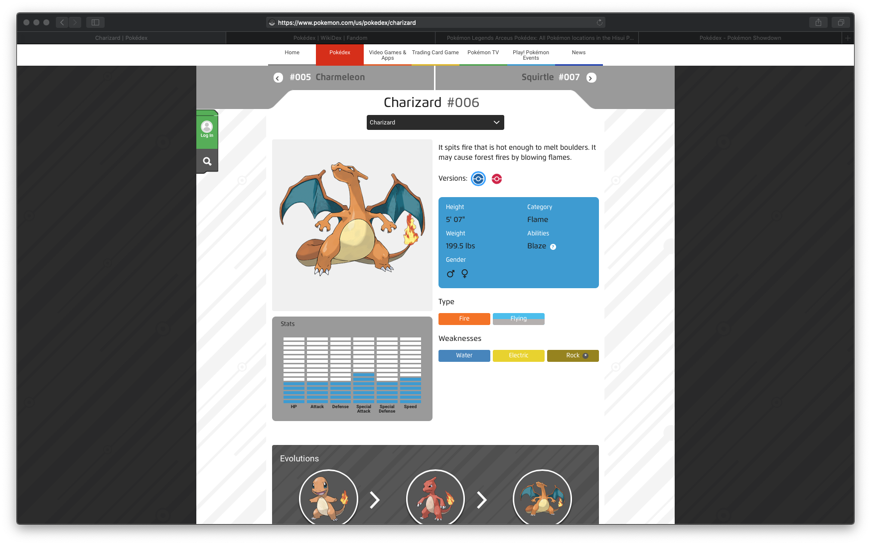
and too much irrelevant stuff, like the anime or the trading card game. Which I couldn't care less about.
The second result is the Pokédex from pokemon.gameinfo.io here's Charizard's entry This is a Pokédex made for PokémonGO players. Which is a game I have never played, nor that I care about that much. Again, it has too much irrelevant information and misses what I would find relevant.
A similar problem happens with Bulbapedia. It has information about every aspect of pokémon. But I only care about the mainline games. So, there is a lot of useless information for me. In fact, so much that I have trouble finding the "games" section on any one article. (I have ADHD so this may be a very particular problem of mine and not a design flaw of Bulbapedia's)
Serebii is a little bit more relevant for me. Because even if it has info about all the pokemon ecosystem, it is "segmented" in a sense, so I can easily avoid information about the anime when researching. The problem with Serebii is that it looks horrible (remember the emotional design part?). And the navigation is really confusing for me.
Finally, there's the Pokémon Showdown! Pokédex. Which is geared toward competitive players. But I suck at competitive pokemon. So, although it has a lot of in-depth information, It is not very relevant to me.
BUT!
It has really good interaction. It is uncluttered and presents the relevant information really well. You type in a search bar and a list of suggestions appears in real-time. Then, if you click on any one of those the screen divides into two halves. One for the search and one for the pokémon's entry.
I think that Pokémon Showdown!'s Pokédex interaction is very well designed to achieve its purpose: quick lookup of relevant information. I would say it is very "hirable". In as much as the job I need a Pokédex to do really well is to lookup relevant info seamlessly when I'm playing.
So I have at least three needs.
An interface optimized for quick lookup,
with only relevant info and
a seamless experience.
The outcome should be an app that performs those things well. That's the job.
After this brief analysis of available options, I should reason about what I want in a Pokédex. I mainly use the Pokédex to find each Pokemon's Pokédex entry, locations, the moves they can learn, types and type matchups, base stats, and info about their leveling methods.
If you are not a pokénerd like me, this won't make sense to you. But if you are, you can see that I am your typical casual player that focuses primarily on filling out the Pokédex.
Structure
Here I need to figure out the components of my app. And how they relate to one another to fulfill the job I stated above.
Search bar with update-as-you-type behavior
Pokémon catalog or "browser" in a grid
Info "page" that slides into frame without reloading
Map "page" that slides into frame without reloading
One of my goals is a seamless experience, so I need the app to be a single-page application that doesn't reload. And the two main components, the browser/search, and the info "pages" should lead very easily into one another.
I can already see some stretch goals that would be nice to have.
User accounts or at least local storage.
"collection" tracker for individual users.
A mobile version of the app.
You may be concerned a little because of that last point. As it implies that I am not taking a "mobile-first" approach with the interface. That's true. But when playing I mainly use a Pokédex on my laptop.
And on the other hand, if make a mobile app (or mobile-size responsive web app) I intend to build it all from scratch. Because the current interaction system I have in mind works better on a larger screen.
Let's take a look into that.
Interaction
The interaction should be quite simple. And I will focus especially on that "seamless" experience.
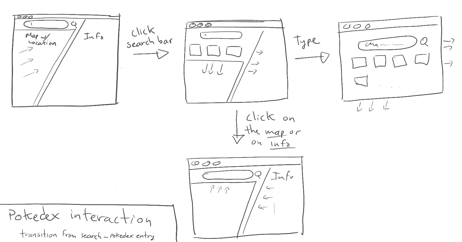
The very first thing you see is a search bar and a grid of all pokemon. As you type, the results on the grid get filtered out. If you click on any one cell, a frame slides from the side occluding the search section.
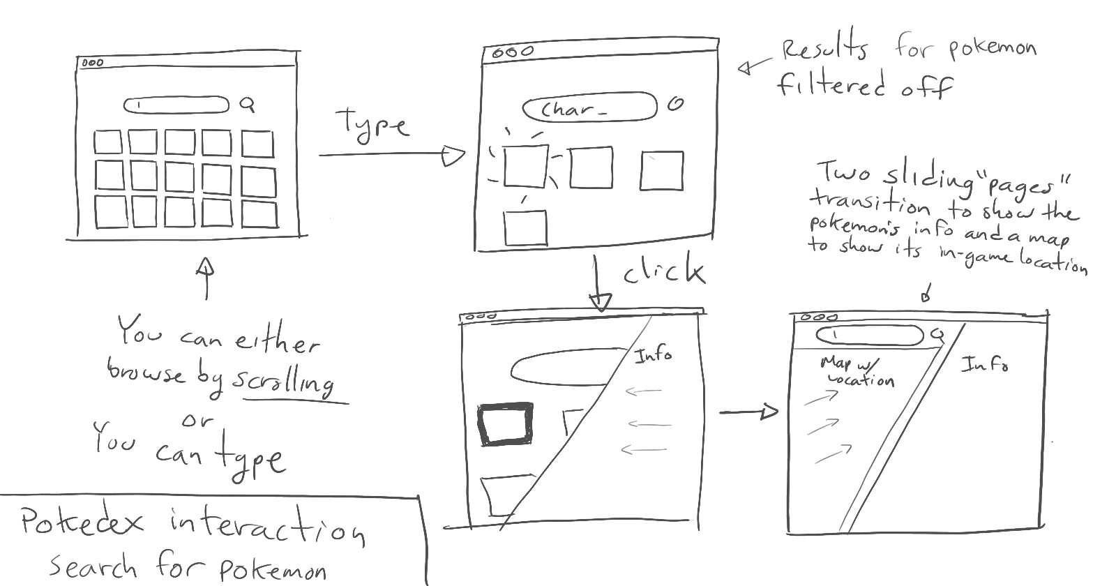
If you click on the search section, a "transition" state will activate where you can choose from some suggestions or start typing. Which will take you back to the search state.
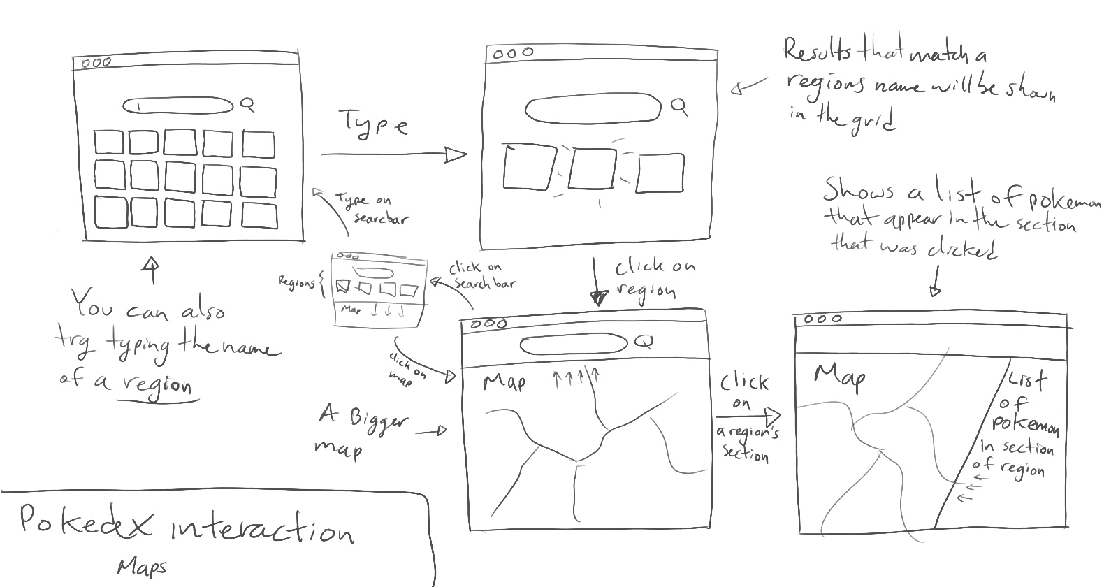
You can also search for the map of a particular region. In that case, the search state will transition to a "map" state. The interaction is more or less the same. But there is an intermediate state, where you can click on different sections of the map to see a list of pokémon that appear in that section. If you click on the pokémon, it will take you to the pokédex entry.
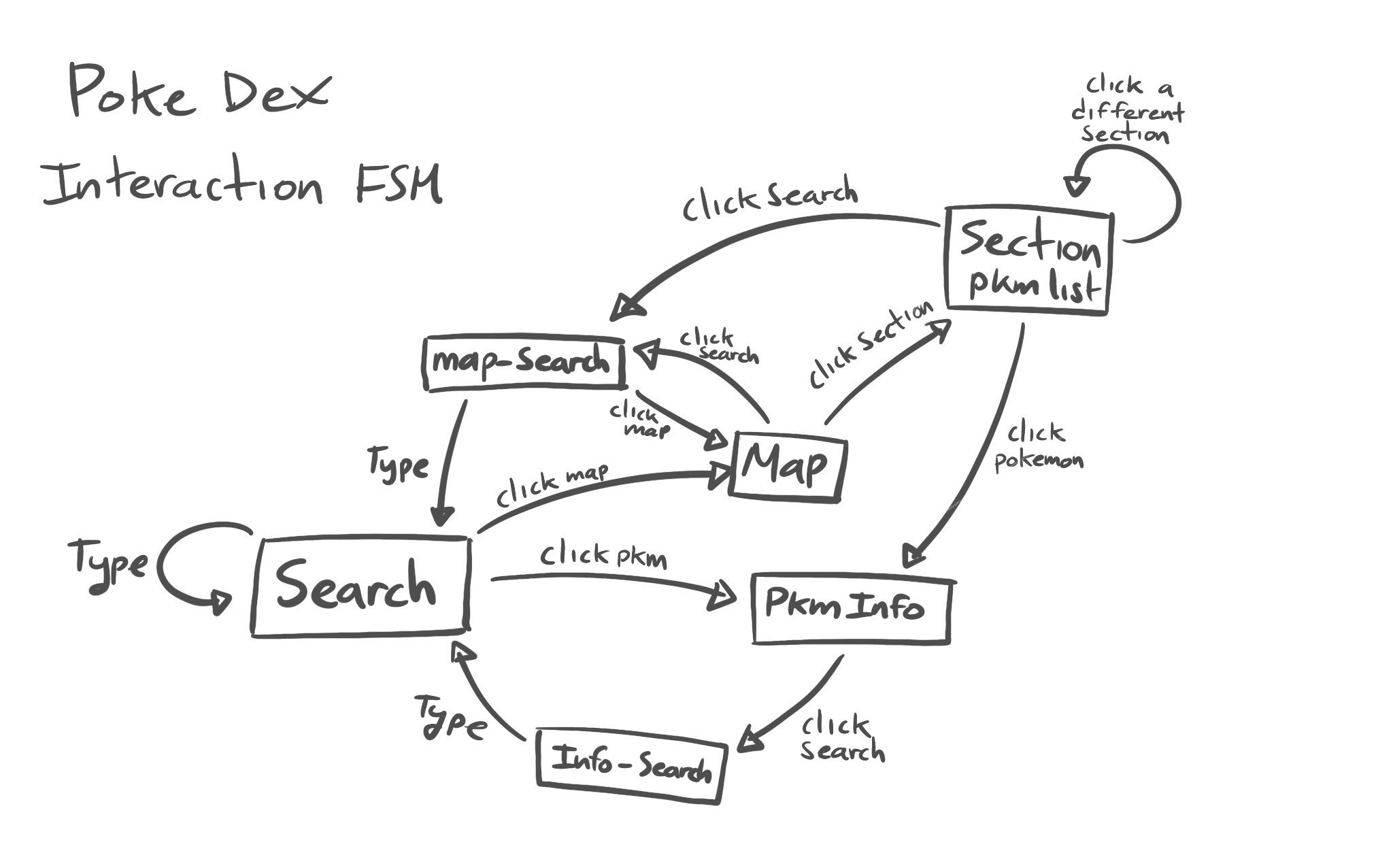
Finally, here's a diagram of the implied finite state machine for the interaction with the pokedex.
 I made a prototype with Framer. You can play around with the basic "loop".
Visuals
I will work on the visuals with Figma and/or the Procreate app on my iPad. There are some aspects I am already considering
- The visual design will be heavily inspired by Pokémon Sword and Shield game's interface. Clean, flat, sharp, and animated.
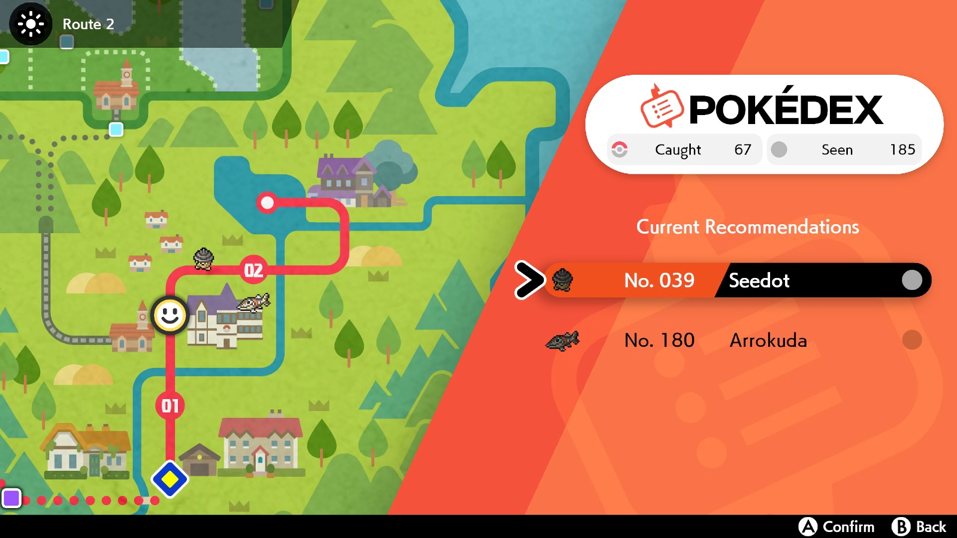
A three-section layout. Search, map, and info. The "background" will have the search bar and browsing grid. The other two will be "sliding" pages.
I will implement the "page" for a pokémon and the map following the "paper page" material metaphor from google's material design.
Other material design principles like the animation for "sliding" paper, as well as bold, sharp, and flat colors and figures to guide attention.
Preliminary technical considerations
I will use Next.js with tailwindCSS for styling and framer motion for animations.
I want to serve static pages that get hydrated with data coming from the PokeAPI
I will use a basic 3-component page. And the app should update the inner contents, size, and animations of each component based on the implied finite state machine for the interaction.
I want to try caching and prefetching from an external API.
I am still unsure what to use for the backend, if any. And for dealing with PokéAPI's graphQL API. But if I go with the stretch goal of adding users, I will probably use AWS amplify.
Epilogue.
In the next post, I will explore the technical considerations of implementing this design.
Please note that I am learning this stuff. So any feedback will be greatly appreciated!
I will also be updating on Twitter with the hashtag #BuildInPublic
So maybe follow me on Twitter?


